Asin
Asin (translated as ‘salt’) was a Filipino folk rock band active during the 70s and 80s. Their songs were populist and subversive, often singing odes to the working-class people and lamenting the unfettered exploitation of natural resources. In this project, I imagined a 2020 reissuing of their 1978 self-titled debut album and their accompanying concert tour across the Philippines. I designed the band’s logo, album artwork, lyrics booklet, merchandise, gig poster, and social media promotional material.
Band Logo
For the band logo, I wanted to highlight the strong cultural identity emphasized by Asin. The band’s music aims to celebrate Filipino cultural heritage, especially of pre-colonial Philippines. They used indigenous instruments, including the kulintang, alongside their guitars and drum kits. This blend between the traditional and the modern, the indigenous and the western, is reflected in the logo design. The latin alphabet spelling ‘ASIN’ is rendered with a sleek sans serif font. Placed on top of this type is the band’s name written in the indigenous Filipino script called Baybayin. This flowing, calligraphic type is juxtaposed with the stern, industrial type underneath. This type-contrasted logo corresponds with the band’s contrasting lyrical content: of the pastoral and the industrial, of war and peace, of the oppressors and the oppressed, etc.
The primary colors used for the logo are red and yellow. These colors evoke an emotional immediacy that matches the band’s messaging. Their calls for social and environmental justice was, and remains, urgent, thus the design feels urgent as well.
Album Artwork


The album artwork reflects the album’s themes of diametric conflicts: trying to find natural balance in the face of industrial exploitation, longing for inner composure amidst social unrest, etc. On the front cover, basic shapes mimicking minimalist paper cutouts depict a harmonious composition of trees. These trees are swaying forward evoking the winds of history and progression, of a change taking place. Their foliage is colored with a green and blue gradient signifying earth and water. They are placed on a red background, once again underlying a sense of urgency.
On the back cover, the viewer sees the cutout trees literally cut down bald. The harmony of the front cover is replaced with a disordered placement of trees. At the center is the album’s track listing organized in the shape of one of the front cover’s foliages — as if the songs form the memories of (and longing for) a vanished life.
Lyrics Booklet


Complementing the red album cover, the accompanying lyrics booklet is a solid green color. The front cover features two cutout photos of indigenous Filipino instruments. The red and yellow gradient on one of the photos complements the green and blue gradient on the album cover.
The designs for each spread are meant to reference the lyrics of the songs displayed on each spread. The first spread, with its blue and green organic forms, refers to the first song ‘Masdan Mo Ang Kapaligirian,’ which speaks of environmentalism.
The second spread has a starker red color with cutout images of Filipino children. The song ‘Itanong Mo Sa Mga Bata’ speaks of the lost wisdom of childhood. ‘Anak’ is a song about the growing pains of adolescence and the eventual defiance of youth against their parents. Directly behind these lyrics is a photo of a young boy holding a toy sword and standing in a rebellious stance.
The third spread features the songs ‘Tuldok’ and ‘Ang Bayan Kong Sinilangan.’ ‘Tuldok’ may be translated as ‘dot’ and speaks of the relative insignificance of the human ego. The latter song is about the singer’s hometown that is ravaged by war and bloodshed brought on by religious conflict. In the middle of the spread is a red circle which acts as a visual reference to both songs: both as a dot and as a drop of blood.
The last spread has a white background, returning full circle to the first spread. It features a photo of a Filipino boy on a water buffalo. The image, with the boy smiling and forward-facing, evokes a hopeful tone that reflects the album’s ultimately life-affirming messages. The organic shape bleeding out the last page recalls the shapes of the first page and helps break up the negative space and provide dynamism to the layout.
T-shirt


Throughout this project, the intention of maintaining a clear, cohesive visual experience across different products and materials is expressed. Here, the front T-shirt design can be seen as an extension of the band’s logo. The back of the T-shirt lists the names of cities included in the band’s nationwide tour.
The cost of printing a high volume of T-shirts is anticipated, which informs the design choice to limit the T-shirt’s printed colors to 2 (white and yellow).
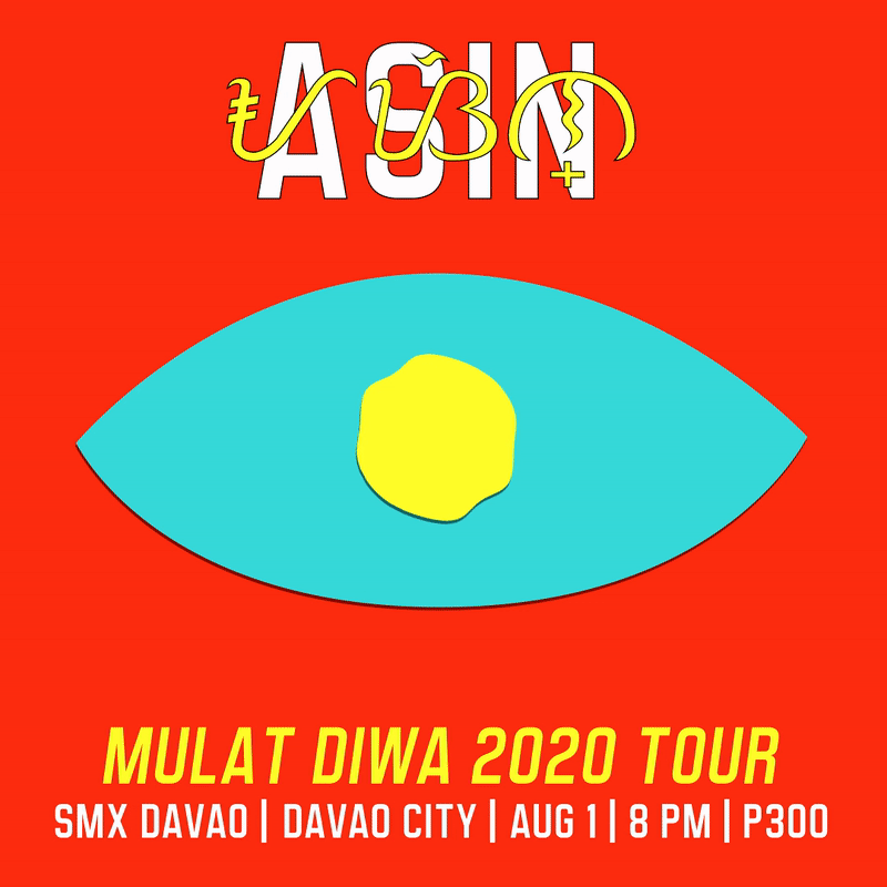
Gig Poster


For the imagined 2020 concert tour, the title ‘Mulat Diwa’ is chosen, which may be translated as ‘awakened mind’ or ‘wide-eyed mind.’ The poster design features a similarly minimal, paper-cut style found on the album artwork. There is a yellow circle at the top of image, the sun, symbolizing consciousness. At the bottom is a blue form, a body of water. The reflection of the sun on the surface of the water forms a human eye. The dark maroon shape radiating out of the eye represents the sight line looking towards the sun, of ‘seeing the light.’ This imagery corresponds with the band’s message of awakening social and spiritual consciousness.
Social Media Promotional Material
These images, both in video and GIF forms, are shareable on social media platforms. They are digital flyers meant to promote the upcoming concert. The design is a continuation of the poster and shares essential design forms with the poster. In the video version, the swirling yellow circle transitions from being the sun to being the eye.